2010年6月13日星期日

Project 3 Final Submission

Newtown is a suburb in the inner west of Sydney. The main street is King street. On King street, you can find great bookshops, excellent restaurants and cafes as well as fashion shops, music shops, antique and import shops.

The sites are surrounded by commercial buildings and there are constant pedestrian and traffic flow. I chose site 1 because it is sandwiched by two buildings so the proposed building will only receive sunlight from the roof. Site 1 has front and back accesses. I thought it will be interesting to focus on this project ways of introducing natural light.

First I analyzed the given environment, the arrangement of the construction to the front street and the site. Then, I thought the space should be intelligent . With a glance of people passing the street, they would be naturally drawn to the building. So I first established a grid that runs parallel with the street, the continuous solid wall, followed by a curved curtain wall, then it leads to a tunnel which help put the visitors in a proper mood for seeing the paintings. All suggest a gesture of welcome.

Considering that the building might be used as other purposes, I would like to make it neutral. The building consists of three main parts, namely the front commercial space, the central gossip space and the back gallery space. There are a series of galleries: a auditorium or lecture room in the front,a conventional indoor gallery for canvases and sculpture, a tunnel gallery for preparing the visitors for the artworks, a central grand hall for large murals and a place of gossip and a corridor gallery beside the central hall.


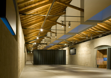
I tried to play with lighting with different techniques. I also referenced Louis Kahn's theory of light that people are made of light, buildings are made of light. People feel refreshed when they are in contact with natural light. The roof is specially made to introducing sun light. There is a long space where opaque glass is used to filter light. The filtered light will then diffuse through the concrete blocks, which I gained inspiration from my tutor and the National Portrait Gallery. They make the space underneath fictional. The use of light on the roof structure shows the length of the building and emphasized the structure, the division of space.(as can be seen in the plans)

The entire building opens to the north, bringing soft light into the gallery. The purpose is to make natural light in the gallery gentle and luminous, providing a sense of connection to nature and life.


The Artist:
Australian artist Robert Owen

The Artwork:
The artwork is based around the work of Robert Owen, in particular Cadence #1 which focuses on the span of time using diverse colours.
BUT the gallery also accommodates for modern paintings and sculpture.
In general, it is a neutral gallery for modern artists and artwork.

Characteristics of the Art Dealer:
He is a very rich and well educated man.
He is not afraid of being seen and wants to show off his collections.
He likes communicating with visitors to the gallery.
He wants to make it a space for gossip or a focal point of Newtown.

Narrative:
A neutral and modern gallery for a well educated man who wants to create a space for gossip.


Intermediate Submission

Plans and Section

Interior Perspectives

Model


Artist and Artworks


Site Analysis


Critiques:

The office plan on the first floor is not adequate.
Need change to the artist studio, may incorporate communications with the visitors.
It may be good to have a double height space in the shop.
Plans are not consistent with the model.
Some errors in the plan such as window position and missing of openings.

2010年5月17日星期一

Precedent Studies

Musée d’Orsay


The transformation of the station into a museum was accomplished by ACT architecture group, made up of M. Bardon, M. Colboc and M. Philippon. Their project was chosen in 1979 out of six propositions, and would respect Laloux's architecture while nonetheless reinterpreting it according to its new function. The project highlighted the great hall, using it as the main artery of the visit, and transformed the magnificent glass awning into the museum's entrance.

The museum has been organised on three levels: on the ground floor, galleries are distributed on either side of the central nave, which is overlooked by the terraces of the median level, these in turn opening up into additional exhibition galleries. The top floor is installed above the lobby, which covers the length of the Quai, and continues into the highest elevations of the former hotel, over the rue de la Légion d'Honneur (formerly rue de Bellechasse).

The museum's specific exhibition spaces and different facilities are distributed throughout the three levels: the pavilion Amont, the glass walkway of the former station's western pinion, the museum restaurant (installed in the dining hall of the former hotel), the Café des Hauteurs, the bookshop and the auditorium.


Metropol Hotel


The design of the Metropol Hotel results both from the respect to the context of Narodni trida –“The National Avenue” – as well as from the vision of a contemporary vibrant downtown with metropolitan palaces, cafés, restaurants and shops facing the street and all other things that support and accelerate modern urban life. Thus, the entire ground floor of the hotel is reserved for an urban café and restaurant which can be fully connected to the street by use of large-size automatically lifted glass panels.

The hotel is draped in a unique fully glazed high-tech façade, a decking, fluently curved at the top. Depending on the intensity of sunlight, the façade is automatically shaded by the use of motor-operated textile awnings which retract in high winds. The windows close automatically in case of rain or when a guest leaves the room. Upon opening them the heating and cooling are automatically regulated. Large-sized glazing allows stunning views of the city. The constant changeability of the multiple layers of the façade adds to the active part the building plays on one of Prague’s most exclusive and eventful streets.


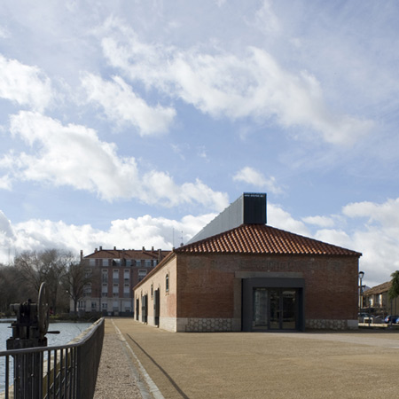
Museum of Water by MID Estudio, Palencia, Spain

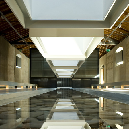
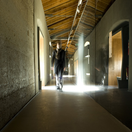
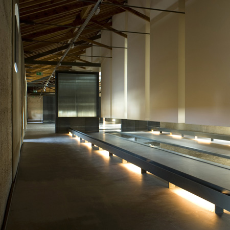
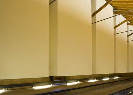
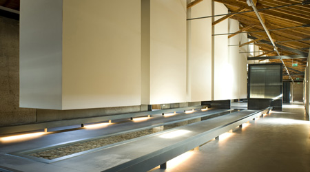
“Boxes” hanging from the skylight go down to light up exclusively the sheet of water achieving a more tenuous and quiet space.

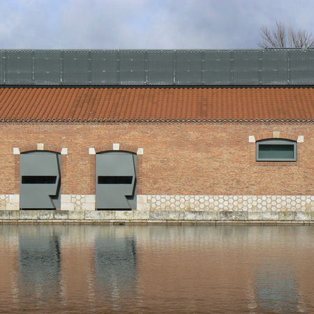
Spanish architects MID Estudio have converted an old grain store in Palencia, Spain, into a museum by blocking up windows and door with metallic and wood boxes on the roof and facade. Called Museo del Agua (Museum of Water), the building has been renovated to house a reception area, and temporary and permanent exhibition spaces.

The creation of the Museum of Water has made it possible to refurbish one of the stores in the dock. The building has a rectangular floor measuring 62,4×10,3m, concrete load-bearing walls with a brick sheet on the outer side and a repetitive rhythm both of doors and windows. Wooden trusses with metallic straps form the roof´s structure.

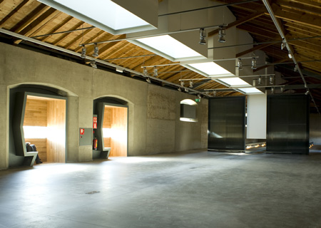
The proposal links the abstract content of the museum to the neutral continent by means of architectural language. A skylight which goes along the ridge of the roof gives sense to the different spaces of the museum bringing and qualifying light into each of them and providing the building of meaning. The skylight is superposed to the pre-existing structure but does not alter it and gets accommodated to its rigorous modulation. That way, both structures, the new one and the old one, complement each other. “Boxes” pending from the skylight bring light inside.

The program is divided in three areas: a reception area with administration and services, a temporary exhibition area and the permanent exhibition area. The building is long and narrow so it establishes a sequential route along the spaces where the visitor always discovers them in the same order.

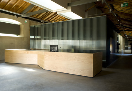
After the access and the reception there is an exempt piece covered in glass so that it dematerializes with a game of reflections. It holds the administration, facilities, toilets and a small store. The visitor should walk around it to access the exhibition area of the museum. The light from the skylight reflects on its cover.

The space for temporary exhibitions is diaphanous and versatile and multiple activities such as exhibitions, conferences, etc can be held on it. The light coming from the skylight, changing throughout the day and the seasons, enters freely through it.

A sheet of water starts at the end of the temporary exhibition area and crosses the permanent exhibition space, situated at the end of the route, compelling the visitor to surround it. “Boxes” hanging from the skylight go down to light up exclusively the sheet of water achieving a more tenuous and quiet space.

At the same time, the permanent exhibition which will be carried out via interactive audiovisuals will be projected onto those boxes´ surface. The tangible presence of the water moving and the sound that it generates are part of the sensory experience of the museum.

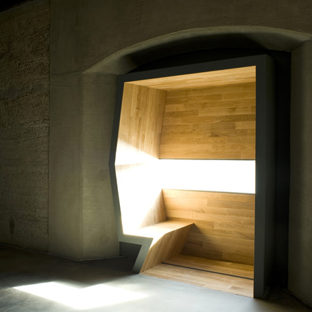
Doors and windows of the existing building are now occupied by metallic and wooden devices. They are designed, like the skylight on the roof is, to drive and filter the light or to direct the visitor´s gaze to the water surface of the dock, as well as to create small spaces which now have the shape of peculiar bow windows where people on a visit can take a break.

Photographs are by Helena Velez Olabarria.
Via Dezeen

http://archide.wordpress.com/2010/05/13/museo-del-agua-by-mid-estudio-palencia-spain/

Art Dealer and Artists

The Artist:
I chose the Australian artist Robert Owen. He has been characterized for the use of diverse materials and approaches that are linked through a poetic sensitivity to the expressive potential of materials, light and colour.

The Artwork:
The artwork is based around the work of Robert Owen, in particular Cadence #1 which focuses on the span of time using diverse colours.
BUT the gallery also accommodates for modern paintings and sculpture.
In general, it is a neutral gallery for modern artists and artwork.


Characteristics of the Art Dealer:
He is a very rich and well educated man.
He is not afraid of being seen and wants to show off his collections.
He likes communicating with visitors to the gallery.
He wants to make it a space for gossip or a focal point of Newtown.

Narrative:
A neutral and modern gallery for a well educated man who wants to create a space for gossip.

2010年5月8日星期六

Final Submission


As inspired by project 1, which I did analysis on Utzon's Villa Can Feliz. I adopted three platforms in my developed scheme, namely the lowest platform for contemplation, the middle platform for working and writing, and the highest platform for private space.
(can be seen in Base Floor Plan and Section)


The material for walls is concrete. By creating certain openings on the walls. It makes people understand that it is about space, not concrete; light within the space and how the space receives the light.

2010年5月6日星期四

Final Model

Model overview

Play of Light

Place for contemplation

Sectional model

Open-close view

Intermediate Submission Plan Section Axonometric


Critiques:
The tower may be taller to exaggerate a sense of sublime.

The drawing conventions used may not be correct.

Certain wall cut in the plan is not reasonable.(like the space beside the staircase)

Cut patterns of the Rock(earth) is not architectural, should be using a more realistic pattern or photoshop the sections.

Notice what happens in the connection between the wall and the roof.(junction details)

Poche drawings should be presented on opaque paper rather than tracing paper.


Some other thoughts
:


We should keep in mind that this is not exclusively a form making exercise - it is an exercise in forming interior spaces

Even though this is not a form making exercise, there will be significant emphasis on form because composition of forms is essential to the formation of enclosure and composition of forms will often produce interesting conditions of gaps/openings/void/shafts/chasms that might provide the light/view quality you want

So, we might need to think of COMPOSITIONAL strategies like folding, stacking, carving, shifting, arranging and so on.