
 The transformation of the station into a museum was accomplished by ACT architecture group, made up of M. Bardon, M. Colboc and M. Philippon. Their project was chosen in 1979 out of six propositions, and would respect Laloux's architecture while nonetheless reinterpreting it according to its new function. The project highlighted the great hall, using it as the main artery of the visit, and transformed the magnificent glass awning into the museum's entrance.
The museum has been organised on three levels: on the ground floor, galleries are distributed on either side of the central nave, which is overlooked by the terraces of the median level, these in turn opening up into additional exhibition galleries. The top floor is installed above the lobby, which covers the length of the Quai, and continues into the highest elevations of the former hotel, over the rue de la Légion d'Honneur (formerly rue de Bellechasse).
The museum's specific exhibition spaces and different facilities are distributed throughout the three levels: the pavilion Amont, the glass walkway of the former station's western pinion, the museum restaurant (installed in the dining hall of the former hotel), the Café des Hauteurs, the bookshop and the auditorium.
Metropol Hotel

The design of the Metropol Hotel results both from the respect to the context of Narodni trida –“The National Avenue” – as well as from the vision of a contemporary vibrant downtown with metropolitan palaces, cafés, restaurants and shops facing the street and all other things that support and accelerate modern urban life. Thus, the entire ground floor of the hotel is reserved for an urban café and restaurant which can be fully connected to the street by use of large-size automatically lifted glass panels.


The hotel is draped in a unique fully glazed high-tech façade, a decking, fluently curved at the top. Depending on the intensity of sunlight, the façade is automatically shaded by the use of motor-operated textile awnings which retract in high winds. The windows close automatically in case of rain or when a guest leaves the room. Upon opening them the heating and cooling are automatically regulated. Large-sized glazing allows stunning views of the city. The constant changeability of the multiple layers of the façade adds to the active part the building plays on one of Prague’s most exclusive and eventful streets.


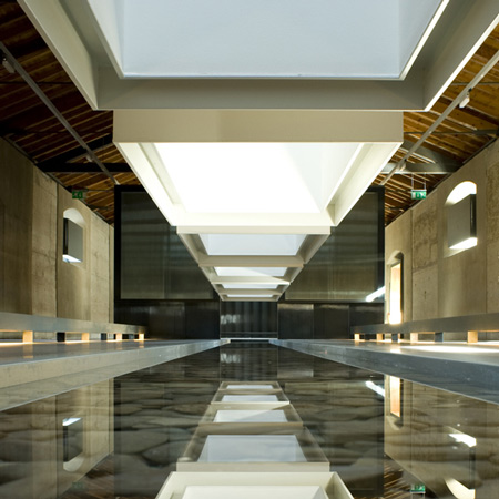
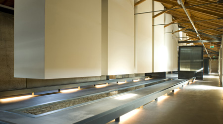
“Boxes” hanging from the skylight go down to light up exclusively the sheet of water achieving a more tenuous and quiet space.
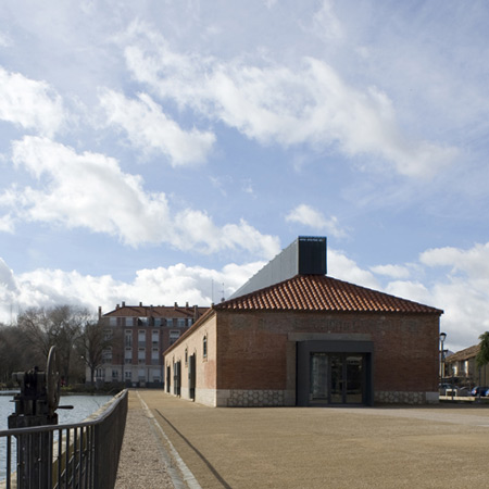
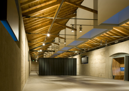
Spanish architects MID Estudio have converted an old grain store in Palencia, Spain, into a museum by blocking up windows and door with metallic and wood boxes on the roof and facade. Called Museo del Agua (Museum of Water), the building has been renovated to house a reception area, and temporary and permanent exhibition spaces.
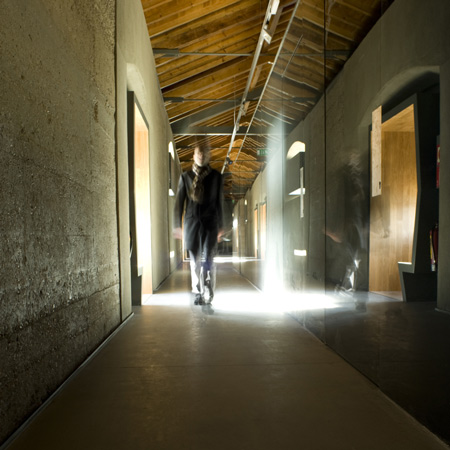
The creation of the Museum of Water has made it possible to refurbish one of the stores in the dock. The building has a rectangular floor measuring 62,4×10,3m, concrete load-bearing walls with a brick sheet on the outer side and a repetitive rhythm both of doors and windows. Wooden trusses with metallic straps form the roof´s structure.
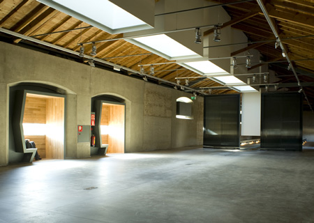
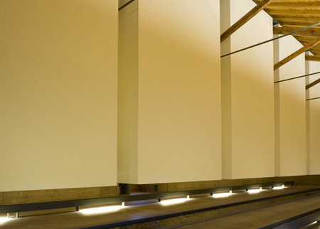
The proposal links the abstract content of the museum to the neutral continent by means of architectural language. A skylight which goes along the ridge of the roof gives sense to the different spaces of the museum bringing and qualifying light into each of them and providing the building of meaning. The skylight is superposed to the pre-existing structure but does not alter it and gets accommodated to its rigorous modulation. That way, both structures, the new one and the old one, complement each other. “Boxes” pending from the skylight bring light inside.
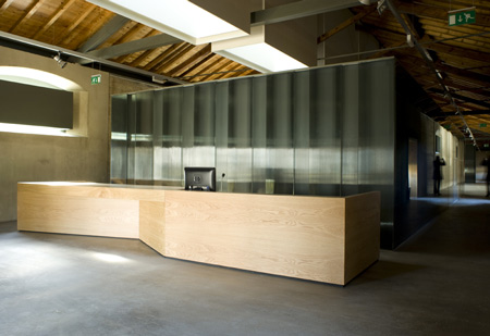
The program is divided in three areas: a reception area with administration and services, a temporary exhibition area and the permanent exhibition area. The building is long and narrow so it establishes a sequential route along the spaces where the visitor always discovers them in the same order.
After the access and the reception there is an exempt piece covered in glass so that it dematerializes with a game of reflections. It holds the administration, facilities, toilets and a small store. The visitor should walk around it to access the exhibition area of the museum. The light from the skylight reflects on its cover.
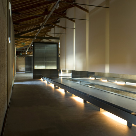
The space for temporary exhibitions is diaphanous and versatile and multiple activities such as exhibitions, conferences, etc can be held on it. The light coming from the skylight, changing throughout the day and the seasons, enters freely through it.
A sheet of water starts at the end of the temporary exhibition area and crosses the permanent exhibition space, situated at the end of the route, compelling the visitor to surround it. “Boxes” hanging from the skylight go down to light up exclusively the sheet of water achieving a more tenuous and quiet space.
At the same time, the permanent exhibition which will be carried out via interactive audiovisuals will be projected onto those boxes´ surface. The tangible presence of the water moving and the sound that it generates are part of the sensory experience of the museum.
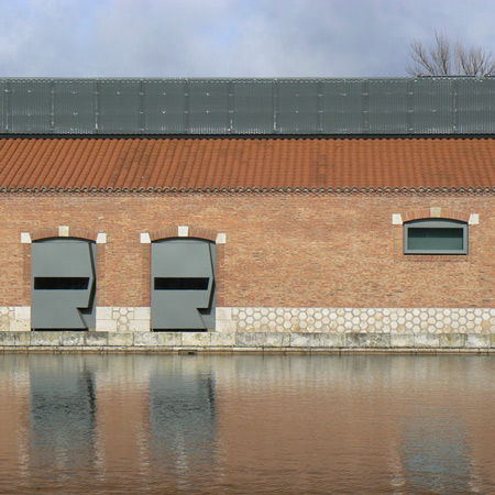
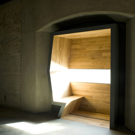
Doors and windows of the existing building are now occupied by metallic and wooden devices. They are designed, like the skylight on the roof is, to drive and filter the light or to direct the visitor´s gaze to the water surface of the dock, as well as to create small spaces which now have the shape of peculiar bow windows where people on a visit can take a break.
Via Dezeen
http://archide.wordpress.com/2010/05/13/museo-del-agua-by-mid-estudio-palencia-spain/
